Google Mobile Friendly Updates: Does Your Website Pass The Test?

Calling all small business owners. Google is making significant changes that will affect how your site shows up in mobile search results. Over 50% of searches are mobile, so you need to pay attention.
Two months ago, Google announced it would begin using mobile friendliness as a ranking factor in search results beginning April 21. Dubbed “Mobilegeddon,” the update means that mobile-friendly sites will get a rankings boost, while sites with mobile usability issues could see a significant drop in ranking.
For small businesses caught off guard, the good news (at least for now) is it appears local map listings (aka Google My Business listings) will not be directly affected. So says Gary Illyes (@methode) Webmaster Trends Analyst at Google. But this is likely only the first of many mobile search updates to come.
Google describes a mobile-friendly website as one that displays properly on smartphones, iPhones, iPads, and tablets. It also loads fast, is easy to read, easy to navigate with minimal scrolling, and avoids plugins like Flash.
If your website is not already mobile-friendly, you basically have three options:
- Redesign your site to be mobile responsive
- Build a new website on a mobile-friendly platform or theme, or
- Redirect to a separate mobile version (m.yoursite.com)
Is your website already mobile-friendly?
Check to see if your web pages pass Google's Mobile-Friendly test.
Use Google Webmaster Tools (free) to get a full list of mobile usability issues across your site using the Mobile Usability Report. Google will tell you exactly what needs to be fixed.
Browse your website on multiple mobile devices and check the following:
- buttons and spacing (not too close)
- text link spacing
- forms are simple and efficient
- viewport: no pinch-to-zoom
- no content larger than the screen
- legible font sizes
- product images expandable
- calls to action front and center
- easy to get back to the home page
- less copy = more mobile usability
- plugins (avoid Flash, Java, Quicktime, etc.)
- page speed
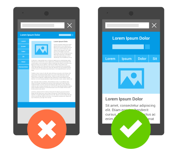 Image credit: Google Developers {Responsive Web Design}
Web-friendly photos and mobile page speed
A slow website will be an even slower mobile website. The best practice with responsive websites is to optimize the site for speed. Google Webmaster Tools provides you with tailored insights and recommendations for boosting your mobile site speed. Enabling compression and gzip can do wonders for page speed.
See also: Why page speed matters
All photos should be web-friendly and reduced to the smallest possible file size while still maintaining the quality you are looking for. Right click on your photo files to access properties, including the file size. Where possible, reduce from MB (Megabyte) to KB (Kilobyte) and from KB to byte. In most cases, you should be able to decrease image file size by 60-90% without giving up too much in quality. And you may notice pages loading much faster as a result!
Reduce the file sizes of your images:
- use 72 dpi image resolution
- reduce to actual display size
- use ‘Save for Web & Devices’ (Photoshop option)
- save photos in JPG format
- reduce quality to between 50-70%
- save graphics and logos in GIF or PNG format (non-interlaced)
- convert images to sRGB (monitor color)
- reduce simple graphics to PNG-8 format (web snap: 50-100%)
- reduce simple graphics to fewest colors (64 colors or less)
Here are some of the better image compression tools:
- http://compressjpg.com
- http://compresspng.com
- http://tinypng.org
- https://kraken.io
Mobile-Friendly = User Friendly
Google wants to provide ALL of your customers with a good experience.
Once mobile optimized, you will want to implement mobile SEO best practices and avoid common mistakes to make sure your mobile site is indexed by Google.
Mobile users are increasingly using their devices for purchase and research. That means getting your web properties mobile-friendly - the sooner the better.
To learn more about mobile sites, check out Google's Webmaster's Mobile Guide or the Principles of Site Design on Web Fundamentals.
To discuss mobile website options with an EZlocal tech, call our support line at (877) 416-2378 and talk to a real person right away. EZlocal offers affordable mobile-friendly websites and mobile conversions/upgrades.
Useful Resources
- Mobile Optimization Guide
- How to determine whether it's time to optimize your site for mobile and gives insight into the various setups.
- Building Smartphone-Optimized Websites
- Official advice from Google on how to get your mobile site in order.
- The Designer's Guide to Image Compression
- Image compression and fundamental concepts you need to know, plus some handy tools that might make your life easier.
- 5 Reasons to Launch Your Mobile Site Today
- EZlocal blog on five reasons to launch your mobile site now.


